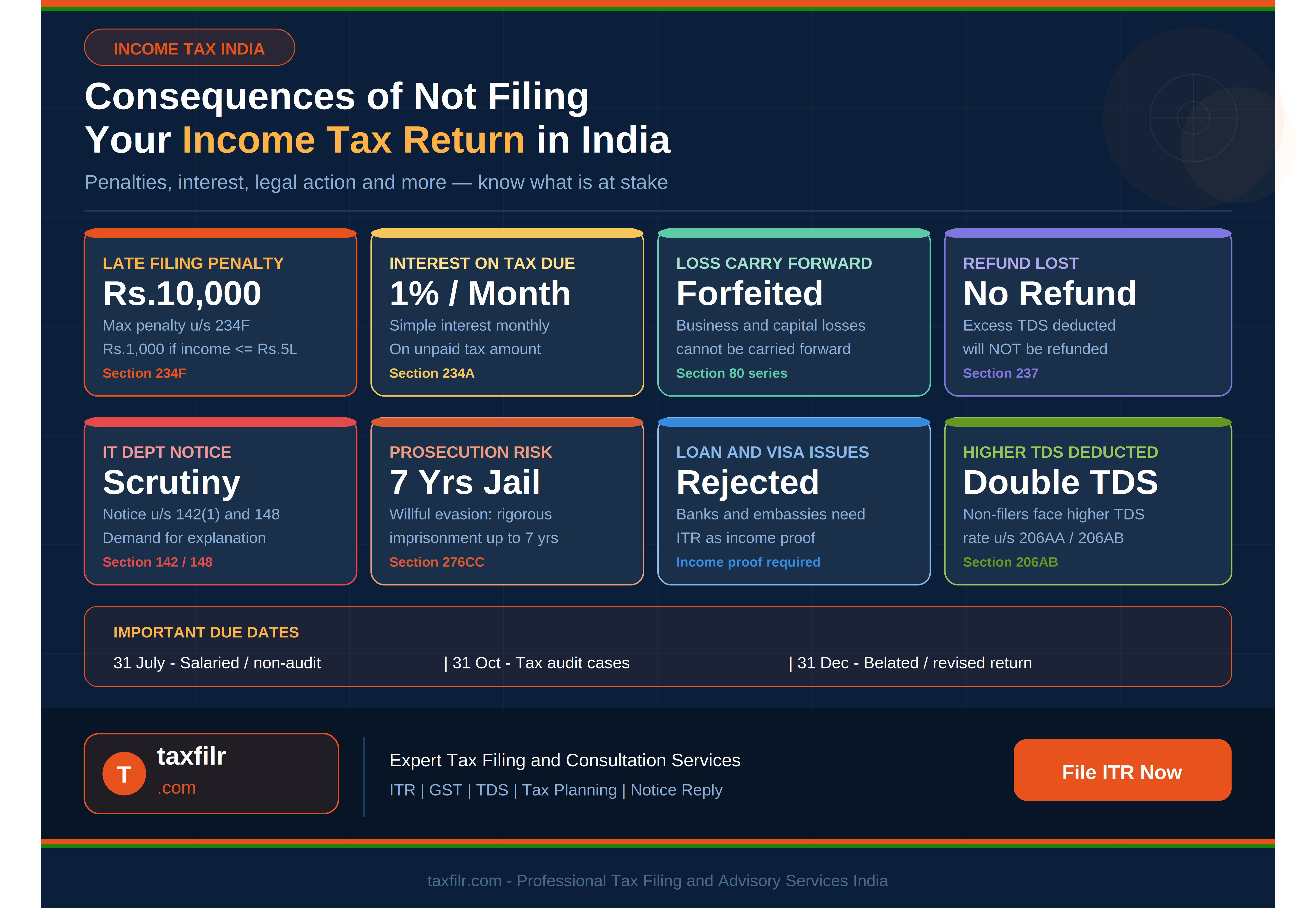
Tax filing often feels heavier than it should. The rules may be familiar in broad terms, yet the actual process can still become tiring: finding documents, checking salary details, reviewing deductions, and making sure every figure lands in the right place. A good income tax efiling site does more than accept data. It creates a calmer path through a task many people approach with hesitation.
That matters for salaried professionals, freelancers, consultants, small business owners, and first-time filers alike. People want more than speed. They want clarity around what is needed, what may cause a mismatch, and what deserves a second look before submission.
Why an income tax efiling site should feel guided, not technical
Tax filing becomes stressful when users are forced to interpret every step on their own. A simpler experience begins with plain-language prompts, an orderly document checklist, and screens that follow the sequence taxpayers naturally expect. Instead of jumping between unrelated sections, the user moves from personal information to income, deductions, tax details, and review in a logical flow.
This is especially helpful during tax return preparation, where small gaps can create disproportionate confusion. A missing interest entry, an overlooked deduction, or a discrepancy between Form 16 and other income records may not seem major at first. Yet these are exactly the details that slow people down. Clear guidance reduces avoidable pauses.
A filing journey built around decisions people actually make
Most taxpayers do not think in technical tax labels. They think in practical questions: “Where do I add bank interest?” “Does this deduction apply to me?” “Why is my refund estimate changing?” A strong filing interface anticipates those moments with concise field guidance, relevant examples, and screens that avoid unnecessary clutter.
That approach keeps users moving, especially people who file only once a year and may not remember every rule from the previous season.
Faster progress without careless shortcuts
Speed matters, but a rushed workflow can create mistakes. The better goal is steady progress with the right checks at the right moments. An effective income tax efiling site should help users complete the return efficiently while still pausing when something deserves attention. For example, it can highlight missing mandatory fields, prompt a review when values look unusual, and make tax summaries easy to understand before final submission.
The same idea applies to the broader experience of using an income tax efiling website. Users should not have to hunt for essential options or guess whether they have completed a section. Progress indicators, saved drafts, structured reviews, and clear confirmation screens make the process feel dependable.
Why visible checkpoints build trust
People trust a process when they can see where they are. A review summary that separates income, deductions, tax paid, and final liability helps users catch mismatches before filing. It also lowers the chance of submitting a return simply because the “Next” button appeared.
Good checkpoints are reassurance, not interruptions. They help filers compare values against documents and spot accidental omissions.
Reducing common filing errors before they become problems
Many filing worries come from ordinary mistakes, not unusual tax situations. Users may type a number incorrectly, forget to add savings interest, select the wrong assessment year, or miss a validation message buried lower on a page. A thoughtful income tax efiling site reduces these problems by making error prevention part of the experience. In more complex situations, guidance from an income tax expert can help users identify potential issues before submission and improve overall filing accuracy
Helpful validation should be specific. “Review this field” is vague. “This amount appears higher than the total entered in salary income” is more useful. People do not just need to know that something is wrong; they need enough context to fix it.
Clarity matters even more for digital-first filers
As more people handle online income tax tasks independently, the interface carries a larger educational burden. Not every filer has an accountant nearby. Clear prompts and readable summaries can keep filing from becoming an exhausting guessing exercise.
This is also where thoughtful microcopy earns its keep. A short explanation beside a field can eliminate several minutes of searching, and a simple warning can prevent an avoidable correction later.
One smoother process for different kinds of taxpayers
A useful filing platform should serve more than one type of user. Salaried employees may want a quick route through Form 16-based filing. Freelancers may need more flexibility around professional receipts and expense records. Investors may need reminders to review interest, dividends, or capital gains inputs. The filing experience should feel adaptable without becoming cluttered.
That balance is what separates a polished service from a basic form. An online tax filing website india users rely on should make room for complexity when required, while keeping simple cases genuinely simple. It should not bury straightforward filers in unnecessary screens or leave more detailed filers without guidance.
Practical support beats generic reassurance
Support content works best when it answers the question at hand. A brief explanation beside a deduction section is more useful than a long help center article. A clear note on document readiness can prevent users from starting before they have the essentials.
The most trusted tax filing websites india users return to tend to reduce uncertainty in these small, practical ways.
Making review and submission feel less intimidating
The final stage of filing deserves special care. By the time users reach review, they have already invested attention and effort. They need a concise summary, not another maze. A strong income tax efiling site should present the key figures clearly: income entered, deductions claimed, taxes already paid, balance due or refund expected, and any items still needing attention.
Many users also rely on the best tax consultants in india to review calculations and ensure that all financial details are entered correctly before final submission. Similarly, professional online itr filing services can help users verify information, reduce filing errors, and complete the process with greater confidence.
Submission should also feel conclusive. Clear status messages, acknowledgment steps, and visible reminders about what happens next help people leave feeling finished rather than uncertain.
Confidence comes from understanding the result
A filer may accept a tax calculation, but confidence grows when they understand why the outcome looks the way it does. If a refund appears smaller than expected, or tax payable is higher than last year, a clear explanation reduces unnecessary worry.
Conclusion
A smoother tax experience is rarely about one flashy feature. It comes from many small decisions working together: clearer prompts, better document guidance, meaningful checks, practical summaries, and a review stage that respects the user’s attention. That is what makes a filing process feel manageable rather than draining. Our income tax efiling site is designed around that idea, helping taxpayers move from uncertainty to submission with fewer avoidable pauses. Whether someone files confidently every year or still feels cautious each season, the right structure can make a real difference. Tax filing may always require care, but it does not need to feel confusing. With a process that explains, organizes, and reassures, users can complete their return with more clarity, better control, and far less friction from start to finish. That sense of order matters, especially during a task people delay until pressure begins to build.
Need Additional Tax Filing Resources?
Discover tools, guidance, and professional support designed to help taxpayers navigate the filing process with greater clarity and fewer complications.
Frequently Asked Questions
1. What makes a digital filing process easier for first-time taxpayers?
A beginner-friendly filing process uses clear prompts, simple explanations, document reminders, and visible progress markers. These features reduce hesitation, help users understand each stage, and make it easier to spot missing information before they submit the return.
2. How can a filing platform help reduce mistakes?
An income tax efiling site can flag incomplete fields, highlight unusual values, organize data logically, and guide users through review steps. These checks make common errors easier to notice before submission, especially for people filing without professional assistance.
3. Is it better to gather documents before starting the return?
Yes. Keeping salary statements, interest details, deduction proofs, bank information, and prior filing references nearby makes the process smoother. It reduces interruptions, improves accuracy, and helps users verify figures carefully instead of relying on memory during filing.
4. Why does the review stage matter before submission?
The review stage gives taxpayers a final chance to compare figures, confirm deductions, check refund or payment estimates, and notice inconsistencies. A clear summary can prevent avoidable revisions and helps the filer submit with stronger confidence and control.
5. Can digital filing still feel personal and supportive?
Yes. Thoughtful wording, relevant examples, timely warnings, and well-placed help text create a more reassuring experience. Even without a person beside them, users can feel guided when the process anticipates ordinary questions and practical real filing concerns.